Responsive websites have become the talk of the town. An increasing number of web developers are now instructed to develop sites that can respond to the size of the screen on which they are being viewed. So, what exactly is a responsive web design framework? In simple terms, this framework is a culmination of standardized codes. All these codes can be utilized during different phases of the web design process in order to develop a robust and reliable responsive website.
HISTORY OF RESPONSIVE WEB DESIGN FRAMEWORKS
Most developers would remember that such frameworks weren’t really used in the early history of responsive web designing. The endeavor at that point of time was to create websites on the basis of the latest HTML & CSS technologies. There certainly were some developers who tried to create their own frameworks, but not all these ventures garnered expected success. In the modern times, though, responsive web design frameworks have become common place, and many developers are making use of the same. They are catalyzing the development of robust and path-breaking responsive websites.
TOP RESPONSIVE FRAMEWORKS
Here are some of the well recognized responsive frameworks, which have managed to reach the zenith of the list of top frameworks.
1. Twitter Bootstrap
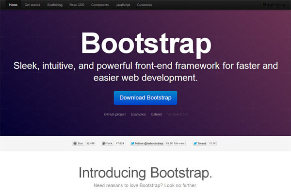
If you belong to the responsive web design fraternity, you would have certain heard about this framework. It is an HTML5 & CSS3 framework, and is extensively used for the designing of web apps and sites. Its free collection of tools makes it all the more attractive. There are various things that the framework contains like typography templates, buttons, forms, etc. One of the reasons why Twitter Bootstrap has been successful is because of the fact that it encourages consistency.
It is also worth noting that this framework is compatible with the latest versions of all major browsers. It started to support responsive designs only after the release of Version 2.0. The latest version of the framework is 3.0. The interesting aspect of this framework is that it is a mobile-first framework. In other words, every website designed with this framework is automatically compatible with a mobile device. Many experts believe that it is the best CSS framework for the development of responsive website designs.
2. Foundation
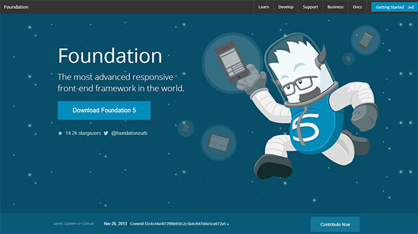
This is one of the new web development frameworks. It comes from Zerb, and contains numerous components that can be used for responsive website designing. The latest version of this framework, i.e. Foundation 5 boasts of a 12 grid system. Over and above that, it also offers reusable HTML components and JavaScript plug-ins. In terms of the styling, this framework supports SaSS stylesheets, which comes as a great benefit for the designers. Another preferred aspect of this framework is the fact that it is open source.
3. GUMBY Framework
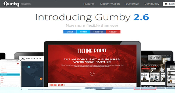
This framework is built on a SaSS processor. Therefore, you have the ability to customize and build designs. What is absolutely imperative is the fact that you need to have basic knowledge about SaSS. Sans that, you might not be able to make the most of the available designing elements. In terms of its compatibility, the framework supports Internet Explorer 8. Additionally, it is also compatible with most of the open source browsers of the modern times. As you might have noticed, it is a complex framework and you need to be aware about various aspects of the framework. However, its simplicity lies in the fact that it gives the developers the ability to develop ultra lightweight designs. That is the need of the hour, and this framework allows you to accomplish the same.
4. HTML Kickstart
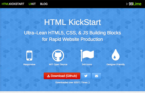
Here comes another framework that has become popular in the recent times. It is an ultra-lean set, and contains HTML5, CSS, and JQuery elements, files, and layout. There are various inclusions in the framework, and they allow you to create top responsive website layouts. What’s more? You can do all of that super quick. You do not need to spend hours in the creation of things like slideshows, menus, image placeholders, etc. This is the reason why many developers are making use of this framework too.
5. UIKIT
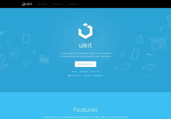
This is the final framework that we shall discuss here today. The reason for the inclusion of this framework is the fact that it is open source and lightweight. Therefore, it saves the developers some cost and also assists in the development of lightweight designs. This is a complete package, and contains various elements like HTML5, CSS, and JS components. The framework is extremely simple to use and allows developers to customize too. There are over 30 modular components that the framework makes available. The grid of this framework is based on a mobile-first approach.
SUMMARY
In short, there are various good frameworks available out there. It is your prerogative to select the one that ideally suits your development needs.
Testimonials: Hear It Straight From Our Customers
Our development processes delivers dynamic solutions to tackle business challenges, optimize costs, and drive digital transformation. Expert-backed solutions enhance client retention and online presence, with proven success stories highlighting real-world problem-solving through innovative applications. Our esteemed clients just experienced it.